Book covers are a lot like people: They come in different sizes and colors, interpreting all kinds of diverse concepts and ideas, seeking attention. Selecting a book cover is an important part of the process of putting together a book, because, let’s face it, we all judge a book by its cover. I know I do. Don’t you?
The advent of the electronic book took the pressure off cover design, at least for a little while. Many of the original electronic readers weren’t capable of showcasing the cover’s art and many authors and publishers took advantage of that to cut back on cost. After all, original cover art is expensive and in the current book market, everyone is looking for ways to increase those very slim margins.
But new electronic readers and tablets are reversing that trend. These newer e-readers are perfectly able to convey the nuances of a well-designed cover, many of them in high definition. Book covers are back and authors and publishers everywhere understand the need to put out covers that grab the reader’s attention.
I want the same for my books. I’ve been very fortunate to work with quality publishers who seek to put together excellent books. In my experience, one of the big advantages of working with independent publishers is that they seek and value the author’s opinions. So I was thrilled when my publisher, Lida Quillen of Twilight Times books asked me for ideas about a cover for The Curse Giver.
I got to work on a range of concepts, from simple to complex, from easy to hard. Original cover art is not just pricy; it’s time consuming and labor intensive. Lots of publishers choose to illustrate their covers with stock art because they can save lots of money. So I was delighted when my publisher selected Brad Fraunfelter, http://www.bradfraunfelterillustration.com/, who proposed a very realistic cover with lots of details in a slightly painterly style similar to the art of Donato Giancola.
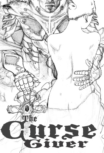
His proposal’s rough sketch was ambitious, following my most complex cover suggestion. It showed a powerful warrior holding a woman whose naked back displayed the faint outline of butterfly wings. At first, I was a little shocked. If you’ve seen my books, you know that none of them showed people on the covers. That’s because I like to respect the reader’s individual imagination. But in his original proposal, the artist didn’t show faces, just bodies. I liked the power I saw in those images. I liked the passion he brought to the proposal.
In the next few weeks, Brad Fraunfelter will be completing the cover. It will be very different from my previous books. I don’t know exactly what the end result will look like, but I have no doubt about a couple of things: It will be an original piece of art and it will be a bold statement.
Want to take a peek?
Here it is!

What do you think?
